8 Examples of CTA’s Done Right
Not having a website call-to-action (CTA) is one of the deadly sins of inbound marketing. Calls to action start the buyer’s journey and give life to a relationship with leads. With the raise of inbound, it’s shocking that 87% of businesses don’t do anything to make even their “contact us” option stand out. I think I even had a small panic attack when I found out that 70% of small business B2B websites lack a CTA. It doesn’t make sense, right?
Everything we do online is a result of a good CTA. Downloads, purchases, clicks, shares…we do it only because someone told us to, and yet most small businesses fail to implement any call to action.
What’s all the fuss about, isn’t a CTA just a “Learn more” button?
No, it isn’t, especially, if you want people to click on it.
You’re reading this, so I guess you’ve known what a CTAs are for a while now. So, I have a good reason for giving them yet another definition – I want to make sure we’re on the same (web) page.For us, a CTA is the words you use to guide your audience through the buyer’s journey.
It’s the same as with any other journey. When you use your GPS, an annoying voice tells you to turn left in half a mile, right? Well, the same goes for your audience – they need the guidance, because your website is your world. You know all the shortcuts, they don’t. And your job is to show them all the cool spots, nice hangouts, short roads and amazing avenues.
But enough definitions and hows and whys…
Why don’t I just show you how some websites do it right?
Let’s look at some calls-to-action (CTA) that make the writer and marketer in me smile. This is where inbound-oriented businesses “meet up” their audience to take them on the buyer’s journey…
AirBNB
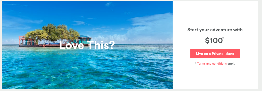
AirBNB does as many things wrong as they do right, but their calls to action are definitely in the “nailed that” category. How about living on a private island?
There are several things that work here:
- show them and tell them: it’s easy to imagine a “private island” but why even make the effort when they show you an amazing one?
- “Love this?”, if you think you can answer this with a “no” you’re way stronger than me
- The copy doesn’t talk about booking accommodation (which is boring and you can get anywhere), it talks about “adventure”, “living” and “private island”. That’s what I call speaking your audience’s language!
- It looks so simple to do it, almost as simple and minimalistic as the CTA design, that I have no reason to say no
Evernote
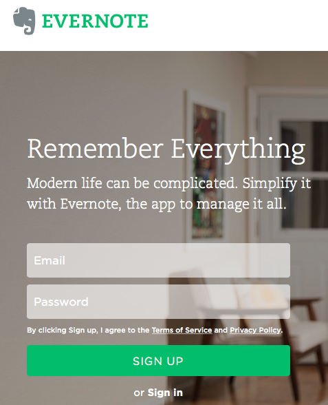
Although the button here says “Sign Up”, the real call to action is “Remember everything”. Note that it has nothing to do with bookmarking websites. The reason we love this one is because it focuses on a benefit even the prospect wouldn’t think about but is everyone’s big pain.
Evernote demonstrate that they know their audience very well and have decided to solve a specific problem for them. This is a perfect example of guiding your prospect with an initial CTA. Evernote shows leads their most important feature first, and then goes on to introduce them to a whole new world of bookmarking.
Eventbrite
Eventbrite doesn’t use impressive landing pages, instead they’ve chose to put their CTAs in the header of their website.
I like the way the call to action stands out as a blue button with genius copy – “create event”. This works because it promises a result rather than focus on a process. This is they key to an effective call to action.
Spotify

Spotify’s growth in 2015 (25% according to the Business Insider) proves that they’re doing something right. Could the powerful CTA be one of the reason for so many new signups? It definitely is – there’re so many things that work great here.
The powerful trigger word “get” is used right in place. Spotify makes a promise without requesting anything (or it seems so). It’s not “get started” or “get a free trial”. It’s “get music” which implies that the process is only one-sided and the person looking at this won’t be asked for anything.
The copy also doesn’t say “our music” which would have been a deal-breaker for most people whose favorite topic is themselves.
Crazy Egg
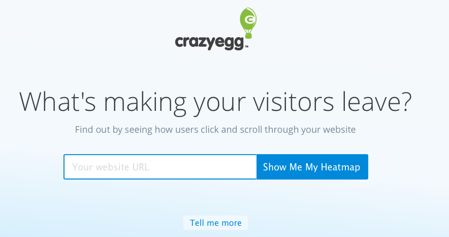
I’m a big fan of CrazyEgg simply because they practice what they preach, offer a great product, and know how to do super-effective CTAs.
The simple yet well thought-out landing page starts with a question that most of us can’t really answer: What’s making your visitors leave? The answer they anticipate is “I don’t know” and then they immediately make you feel at the right place by showing us how we can find out.
This is a great example of using the voice of the customer rather than imperatives (“give me” instead of “take”). Using simple verbs (show me, tell me, leave, find out) and my and me instead of you makes it all very personal and a no-brainer at the same time.
Manpacks
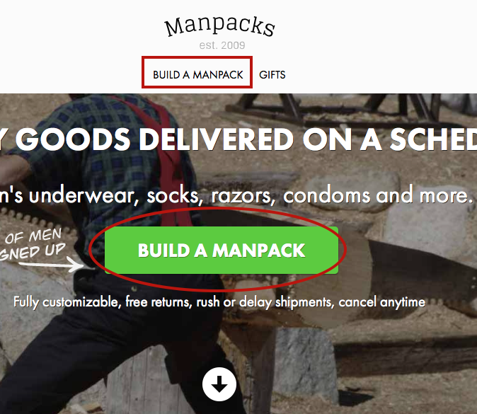
Manpacks.com has become a favorite case study in 2015 for many marketers. Why? because they know what they’re doing. One word here: consistency.
See how they use the same copy for a CTA that is placed in two different places, in two different formats? Everyone who visits the site knows that’s what they should be doing next….building a manpack (I’m not even sure what a manpack is and I already want to build it!)
Square
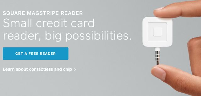
Isn’t that beautiful? It’s one of the most successful image uses in CTA I’ve seen. The trigger word “small” speaks directly to small businesses that are Square’s audience. They not only tell, but show you how small it is indeed. The CTA button itself is the only colorful thing that stands out here – blue and free go well together, don’t they?
This CTA is one of my winners – it has clear benefit, value, it’s simple and clear and points out the result rather than emphasizing the process (“get” instead of “apply”).
Quick Sprout
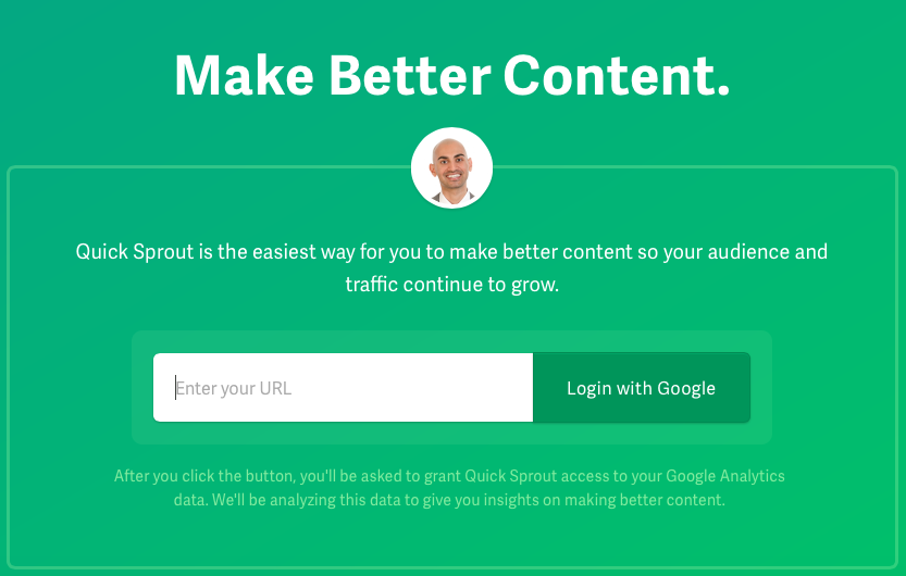
No doubt Neil Patel knows what he’s doing. But even if he didn’t, isn’t this green a winner?
What works here:
- the smiling face of Neil, for one
- focus on the benefit and value of signing up – make better content
- the combination of two information points in one CTA – you’re asked to sign up and provide your URL but it all looks like a single signup form while you actually provide two pieces of information (don’t worry they’ll get your email through Google)
- the lighter green text tells you what to expect which leads to less abandoned signup forms
- more added benefits in the subtitle – “audience and traffic continue to grow”
What’s the pattern of CTA success?
All of those brilliant CTAs focus on the result of the action rather than the action itself. I need to repeat that: focus on the result rather than the action. In all of them you need to click a button, but what happens after that is the essence.
You don’t “learn more” you “build a manpack”. You don’t “sign up”, you “remember everything”. You get what works now, right? I hope so!
But if you still need help figuring out the perfect CTA for your audience, the perfect direction you want to take them to, the coolest hangout where they want to be, we’ll be more than happy to help! The buyer’s journey starts at your homepage. Delight people by showing them the best of your world.
Have we missed something important? Post a link to your favorite CTAs on home pages in the comments section below, you might just become someone’s inspiration.
Leave a Reply